Excel - Creating a Timeline
On May 23,2022 by Tom Routley
Learn how to create timelines under Excel!
Creating a basic timeline
The general principle
We will use a graph where the x-axis will be graduated in years.
Labels identifying the event will be entered one by one.
The vertical axis is graduated from 0 to 10, to set the location of each label, in order to avoid any overlapping.
We will also hide the gridlines .
Procedure
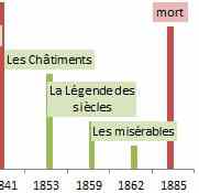
We wish to indicate milestones in the life of Victor Hugo ( series 1), and the publication of his great works (series 2).
The first step is to compile a table of data:
In column A enter the year,
In column B the scale chosen for the biographical events
In column C the chosen literary work .
In column E contain the titles of labels.
Series 1 and 2 have different colors.
Creating the timeline
We select the A1:C9 range and click on Insert/Graph/Column/ 2D histogram .
Graph containing 3 bar of is obtained, as Excel assumes that the numbers in A are the first bar.
Right-click on a bar, choose " Select Data " and " Delete " the " Victor Hugo " series and change the x-axis by selecting A2:A9
" and " " the " " series and change the x-axis by selecting A2:A9 There are 2 bars left and the dates are displayed horizontally.
Right-click on the bar and Format the data set to your convenience.
Remove the gridlines
Right-click on the first bar, select Add Data Labels, click on a label: all are selected, click again: only the label marked as 9 is selected, type the = sign and click in E2:
and click in E2: In the formula bar you can read =Sheet1!$E$2, validate; the label dislays " naissance ".
validate; the label dislays " ". Continue for three other labels. Repeat the procedure for the second series.
Click Format the data labels. Fill-in the first series with a pink color and the second series with a pale green color.
We shall notice the overlapping of the 1853 and 1859 labels, to remedy this, simply change the values ??in columns B and C, for example put 2 in C7 and 1 in C8.
Creating an improve timline
If you want the x-axis elements to be proportional to the dates , you will need to use a table with 84 lines, instead of 9.
There will always be eight dates with events and 65 without date.
The procedure and implementation are exactly the same .
It will thus comply with the time scale and provide a better visualization of the evolution of Victor Hugo.
Article Recommendations
Latest articles
Popular Articles
Archives
- November 2024
- October 2024
- September 2024
- August 2024
- July 2024
- June 2024
- May 2024
- April 2024
- March 2024
- February 2024
- January 2024
- December 2023
- November 2023
- October 2023
- September 2023
- August 2023
- July 2023
- June 2023
- May 2023
- April 2023
- March 2023
- February 2023
- January 2023
- December 2022
- November 2022
- October 2022
- September 2022
- August 2022
- July 2022
- June 2022
- May 2022
- April 2022
- March 2022
- February 2022
- January 2022
- December 2021
- November 2021
- October 2021
- September 2021
- August 2021
- July 2021
- January 2021
Leave a Reply